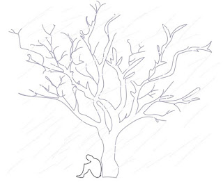
I chose the haiku specifically because I knew I could create something more dark with it. When the poem talks about heavy rain, I was able to envision in my head exactly how I wanted that image to translate on paper. For me, art is my way to express my emotions in a more orderly and healthy way, and at the moment I was feeling stressed and anxious, and the poem helped me translate that into the work I created. I created a digital image of a gray tree, along with a darker gray image of a person crouched underneath it, and I also put in some abstractly dashed rain marks. I chose the rain marks which obviously was incorporated in the poem, to create and set a darker, sadder mood, but I also chose to do the silhouettes of the images to show a more abstracted, yet simple design. To me, this helped get my point across without overcomplicating the idea. Haikus are simple in the way that there are few words you need in able to express a certain idea or feeling, and that is exactly what I wanted to try and accomplish in my work. Simplicity is something new to me because I am used to doing realism and shading, so linework is more difficult and challenging, but it was something I wanted to branch out and try and do. I enjoyed creating continuous lines and focusing on the “big picture” of what I wanted the viewer to see and feel, without overcomplicating it in my head. I wanted it to feel lonely and cold too, and I feel the simplicity of the design helped accomplish that as well, overall.

No comments:
Post a Comment